Blog

Book Review
A review of Modern Color, a celebration of the work of photographer Fred Herzog.
Modern Color, Fred Herzog
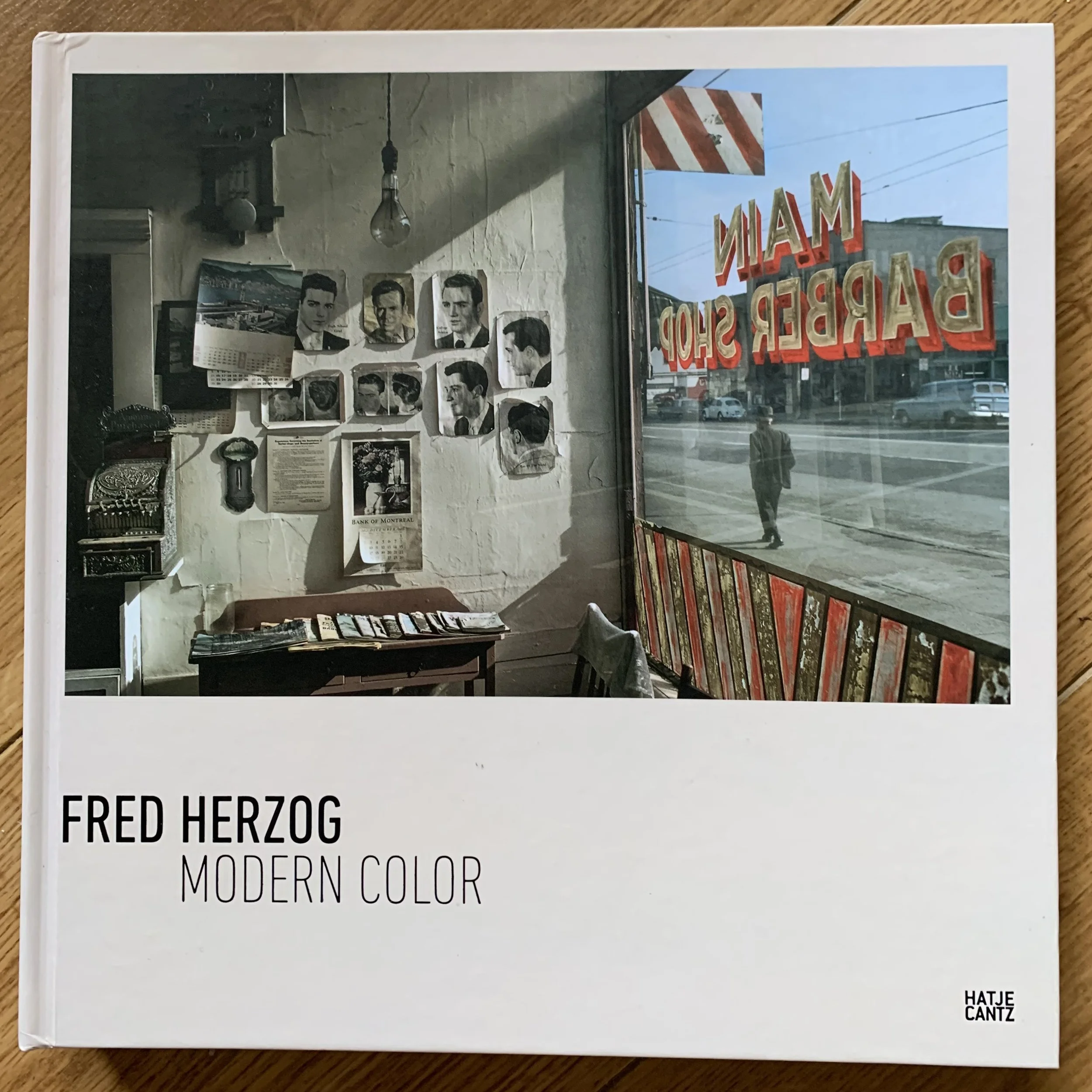
Modern Color, Fred Herzog
Fred Herzog was not interested in glossy fashion photography, or striking product images. Herzog was a photographer for whom the day-to-day held far more fascination. “Nothing interests me as much as everyday reality”, (documentary, dir. Bob Barrett). This is evident in Modern Color (2020), which celebrates Herzog’s masterful eye for colour.
Fred Herzog was born Ulrich Herzog in southern Germany in 1930. In 1952, Herzog sailed to Montreal, took a train to Toronto, and by 1953, had settled in Vancouver, the city where he spent the rest of his life. Fascinated with photography, Herzog and his 35mm Leica motorbiked around “seedy and colorful” Vancouver, photographing architecture, the city’s inhabitant and urban landscapes using his favoured film of Kodachrome.

Double page spread of Modern Color.
Kodachrome was notoriously tricky to process, as it was only developed by Kodak; independent labs were not permitted to develop it, as Eastman Kodak wanted to maintain total control over their product. Though the cost of the film included development fees, it was still expensive, as users had to post the film to Kodak for developing. The US Government found this practice to be in violation of anti-trust laws, so Kodak, forced to provide development licenses to other labs, sold the film, with customers having the option to choose whether they wanted development costs included. Despite the limitations of his preferred film, Herzog remained true to Kodachrome and as a result, his vivid colour photographs stood out against the swathe of black and white images that were so prevalent at the time.

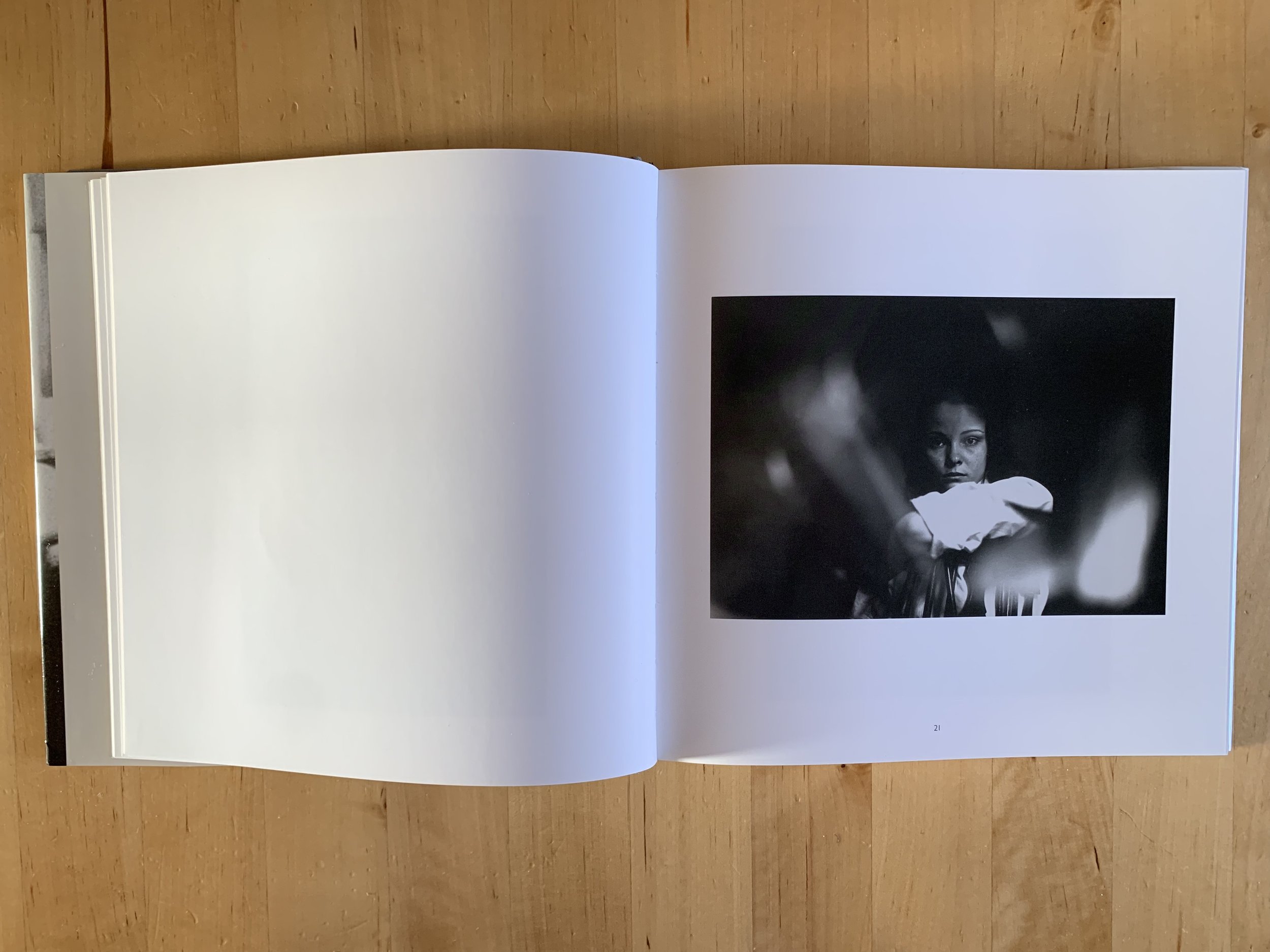
Red Stockings. Fred Herzog, 1961
Modern Color's introduction provides valuable contextual information on Herzog’s life and work, which is thoughtfully reproduced in German at the rear of the book. The photographs range from night time shots illuminated by vivid neon street signs, to subtly-coloured images of weatherworn clapboard houses, the peeling paint adding extra textual interest. A quick peek at the Instagram feed of almost any self-styled street photographer will reveal Herzog's influence; the man in the barber’s chair having his hair cut (U.R. Next, 1959), legs, from the knees down (Red Stockings, 1961), and the architectural images of stairs, framed by strong shadows (Staircase, 1958). Hands up if you’ve photographed one or more of these. I may be sticking my neck out a little here, but I bet many photographers have, at one stage. I know I have. Sorry.

Ferry Barber Shop. Fred Herzog. 1959
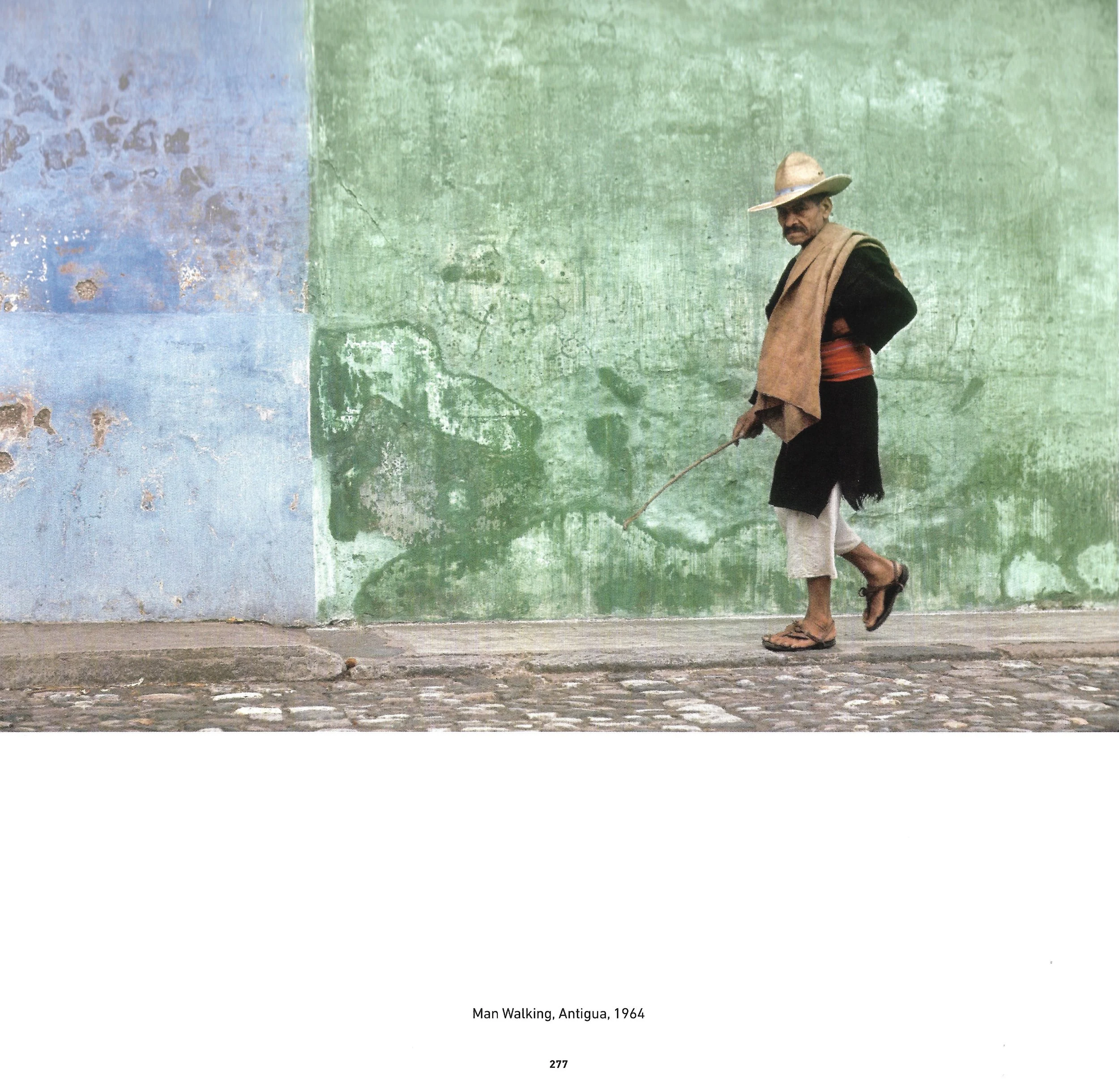
Man Walking, Antigua. Fred Herzog, 1964
Herzog documented everything in his adopted hometown of Vancouver with a practiced eye, and his archive has become an important historical document, recording the growth of the city in the aftermath of World War II. He may not be as well known as some of his contemporaries, like Saul Leiter or Gordon Parks, but Herzog’s style has inspired many digital photographers to the point that many are creating their own Kodachrome-inspired digital presets.
In a book entitled Modern Color, it comes as a surprise to see several black and white photographs interspersed with the colour ones. There’s no obvious explanation for this, but I can attest that the black and white images act as a visual palate cleanser after imbibing copious amounts of rich, eye-popping colour, and act as a reset before the next course. Fans of black and white photography might dismiss Herzog’s work, but in the canon of post World War II photography, Herzog is definitely an innovator, paving the way for colour photography to become a legitimate art form.
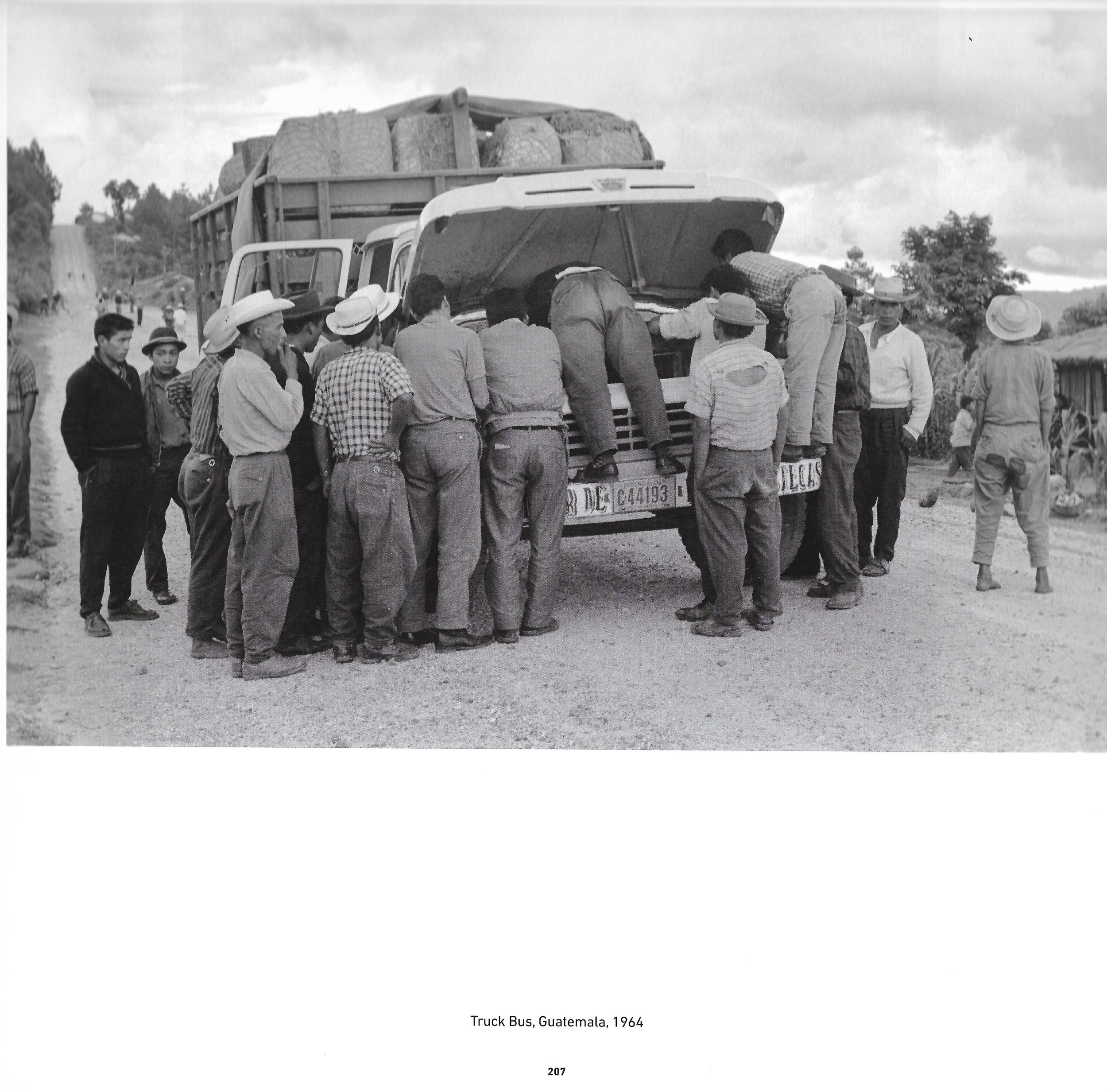
Truck Bus, Guatemala. Fred Herzog, 1964.
This a hefty book which will look great on your coffee table and add to your knowledge of the great photographers of the 1950s. It costs around £30 from good and evil booksellers.
Book of the Month
I love books. Fiction, non-fiction, old books, new books, hard-backed, paperback, dog-eared, coffee-stained or in pristine condition, I love them all. But the books I love most of all are photo books, particularly monographs.
Artists and photographers require a constant source of inspiration in order to keep their own work fresh and to help them see critically. It’s pretty easy to get that inspiration from other artists and photographers online, but to have a real understanding of their process, motivation and intent, a monograph is invaluable and provides an insight that cannot always be gained from blogs and social media.
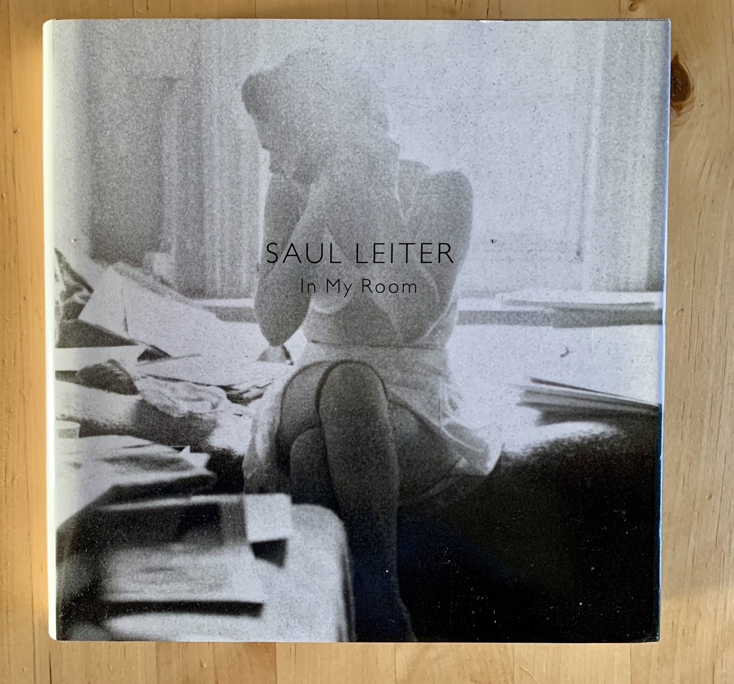
One of my favourite books is Saul Leiter’s In My Room (2017), a collection of some of the most beautifully drawn black and white nude photographs I have seen. The photographs were drawn from his extensive archive and feature a variety of female friends and lovers in relaxed and unguarded moments, whilst in various states of undress. There is clearly an element of the male gaze here which should not be overlooked; the photograph on the frontispiece shows Leiter fully clothed whilst his female companion is semi-clothed, but what strikes me most about the images is the lack of coyness displayed by the subjects. These women are deliberate and almost defiant in their response to the camera’s eye; they do not shy away from returning the gaze in an almost provocative fashion.

Saul Leiter, In My Room, 2018
The photographs were taken in natural light, my personal preference, and have visible grain, some are blurred, others are sharply focused, some have over-exposed areas - see the cover photograph, for example, and other have have blacks so deep and dark that at first glance it’s almost impossible to identify facial features or any body parts at all. What they all have in common, however, is Leiter’s practiced eye in capturing private intimacy that almost borders on voyeurism.
Saul Leiter, In My Room, 2018

Saul Leiter, In My Room, 2018

Saul Leiter, In My Room, 2018
If you’re already aware of Leiter’s work through the seminal Early Color, do yourself a favour and purchase a copy of In My Room. The slow, almost mediative nature of these black and white photographs are mesmerising.

Trust the Process and Forget About the Outcome
I recently had a dry spell of creativity, culminating in a 133-day period (yes, I counted), without taking a single photograph, not including using my iPhone. One hundred and thirty-three days. That is exceptionally poor as a photographer and it definitely was not helping me to move forward with my practice. I place the blame squarely on the combination of post-degree burnout and lockdown-related ennui. I simply could not face picking up the camera.
Despite being temporarily camera averse, I still wanted to create something, anything, so I began to create some cyanotypes. The simplicity and beauty of cyanotypes, for me at least, is that it is a slow process. The chemical process is in charge here, not the artist, so having to patiently wait for the UV rays and ferric ammonium citrate and potassium ferricyanide to work their magic is a wonderful antidote to the frenetic, greedy rush of the digital shoot-edit-share process.
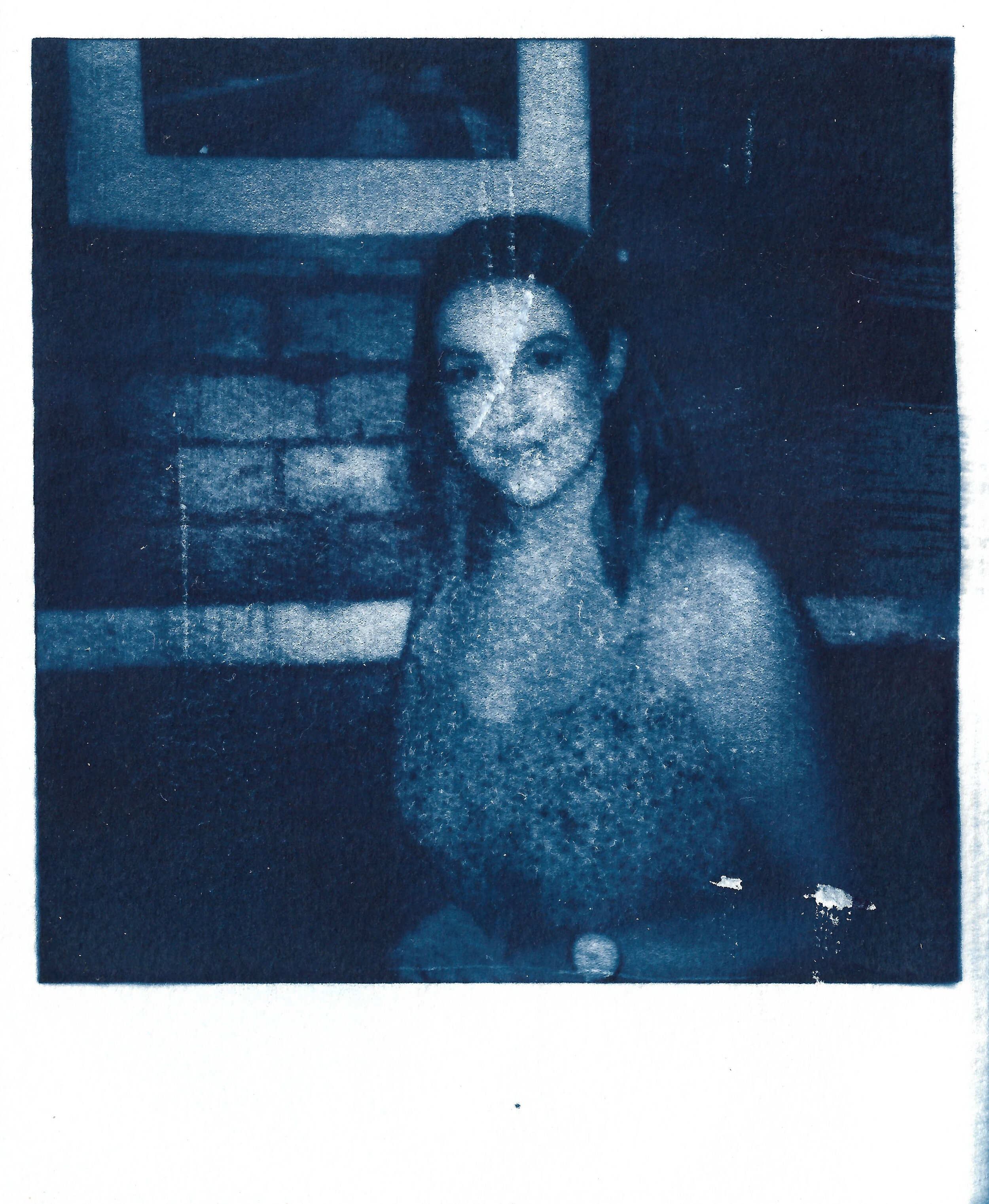
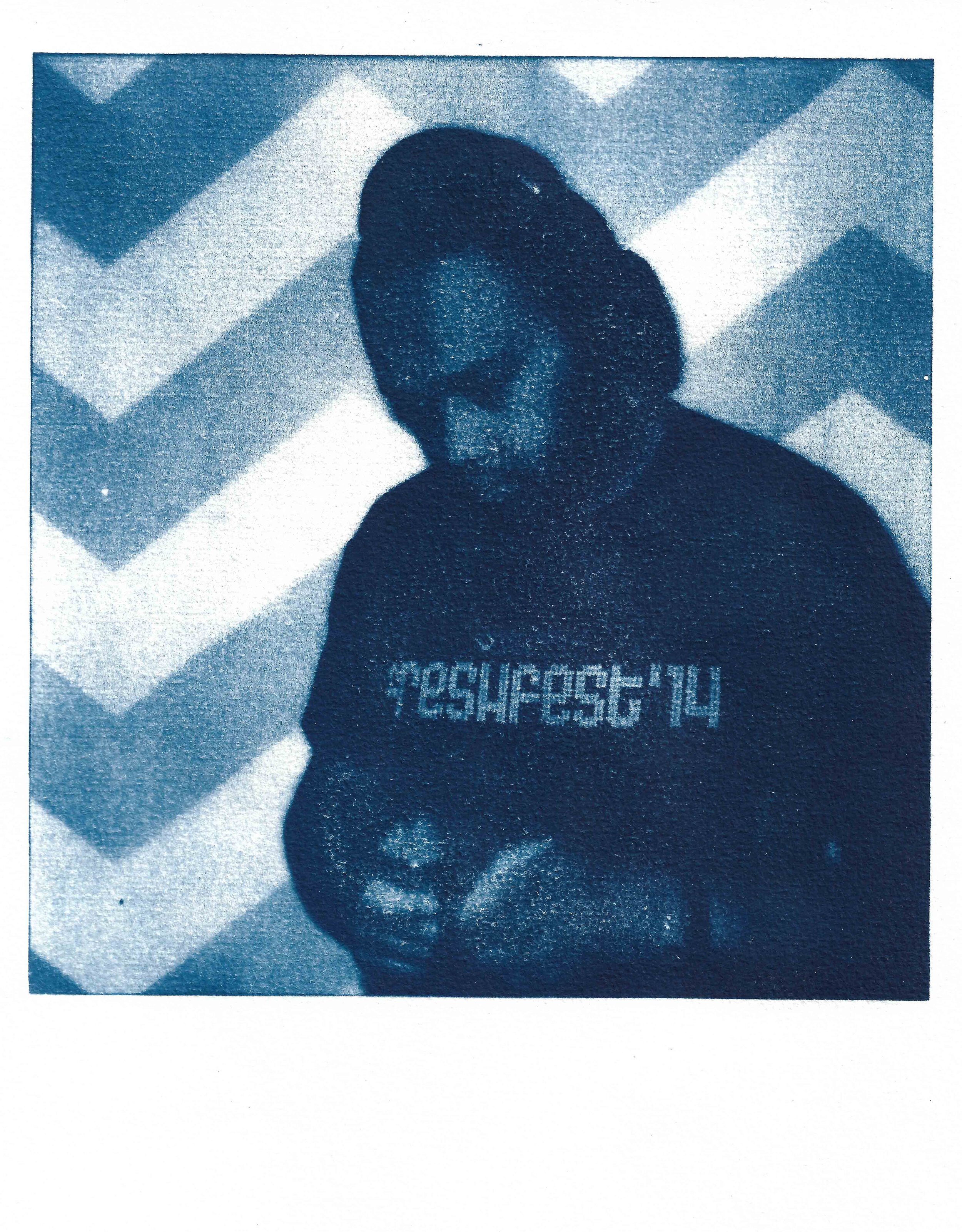
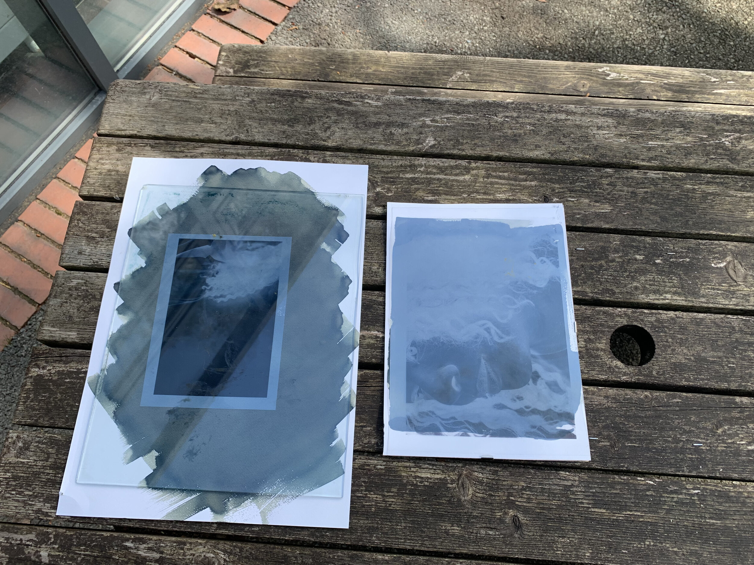
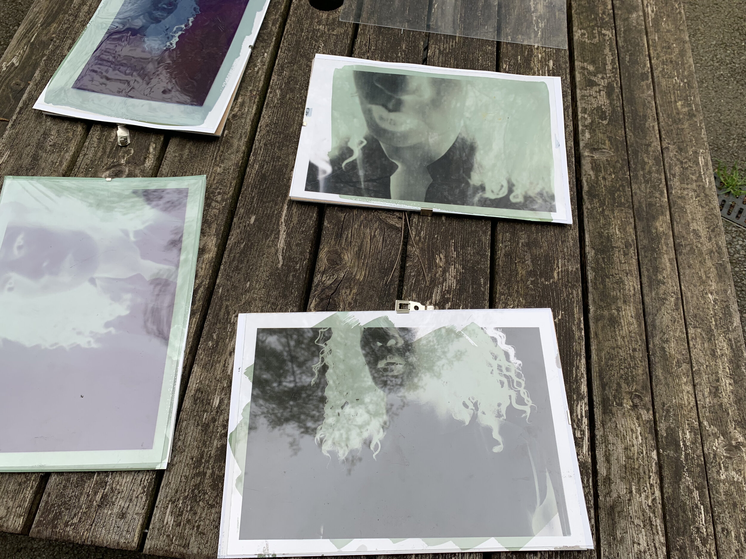
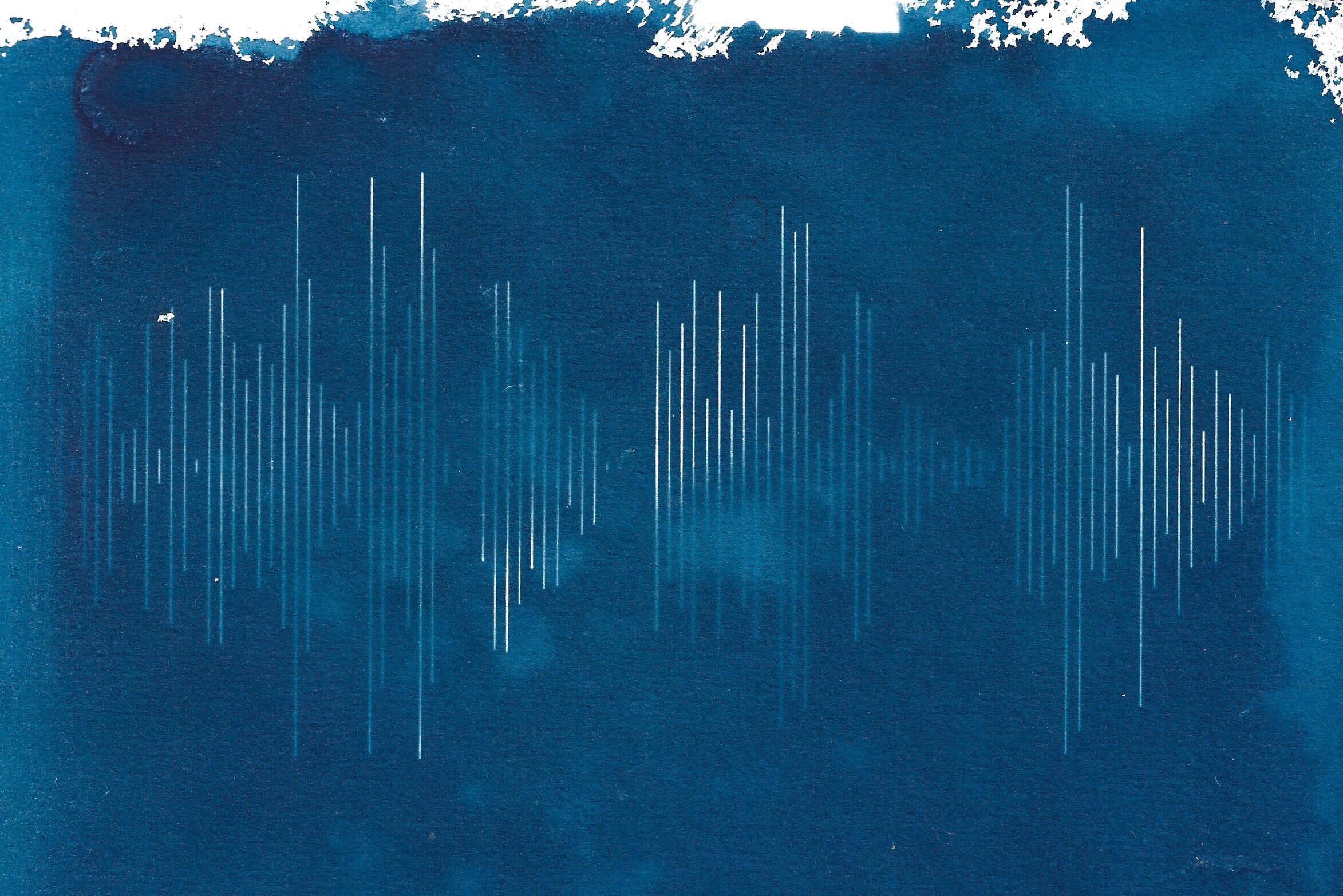
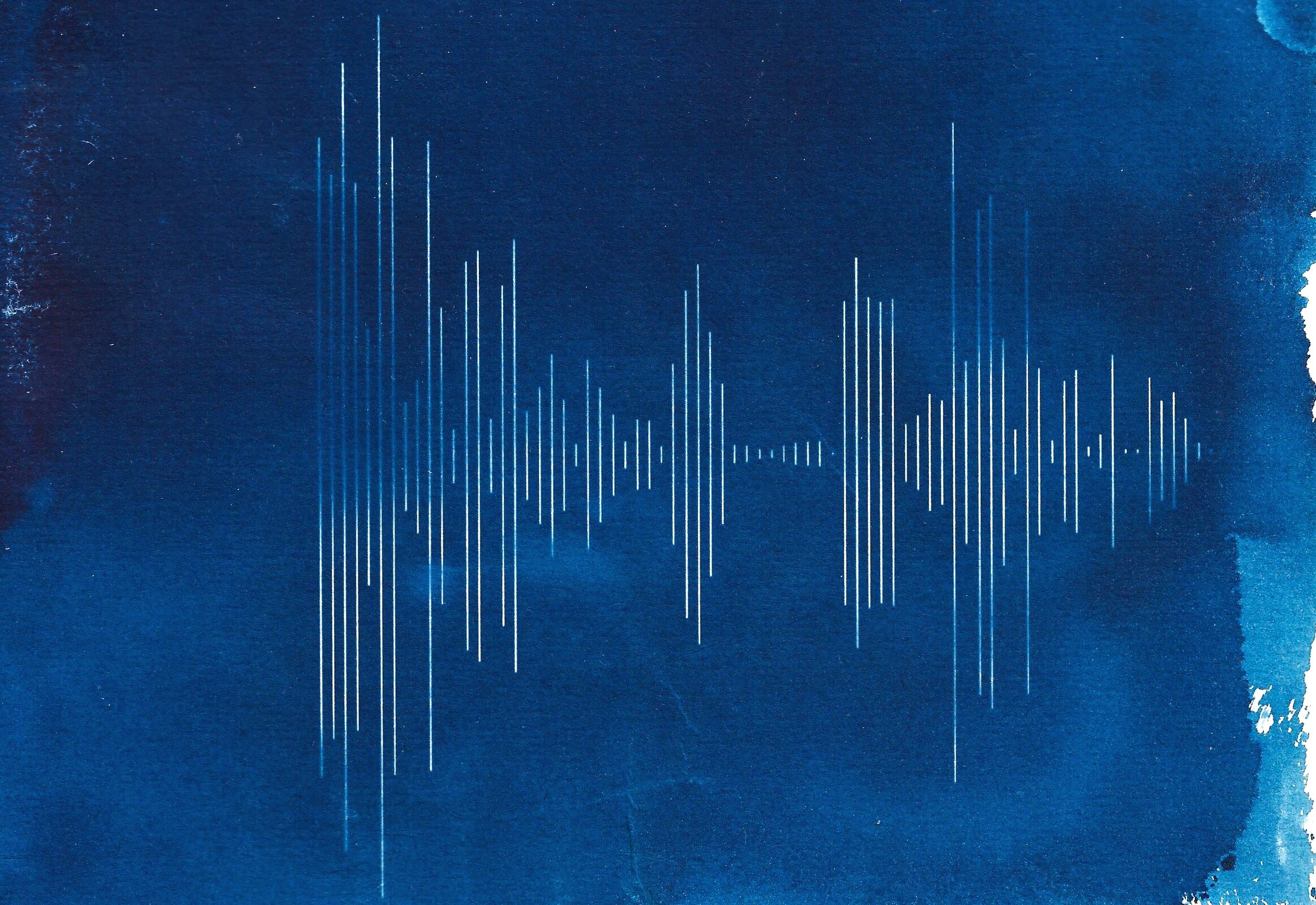
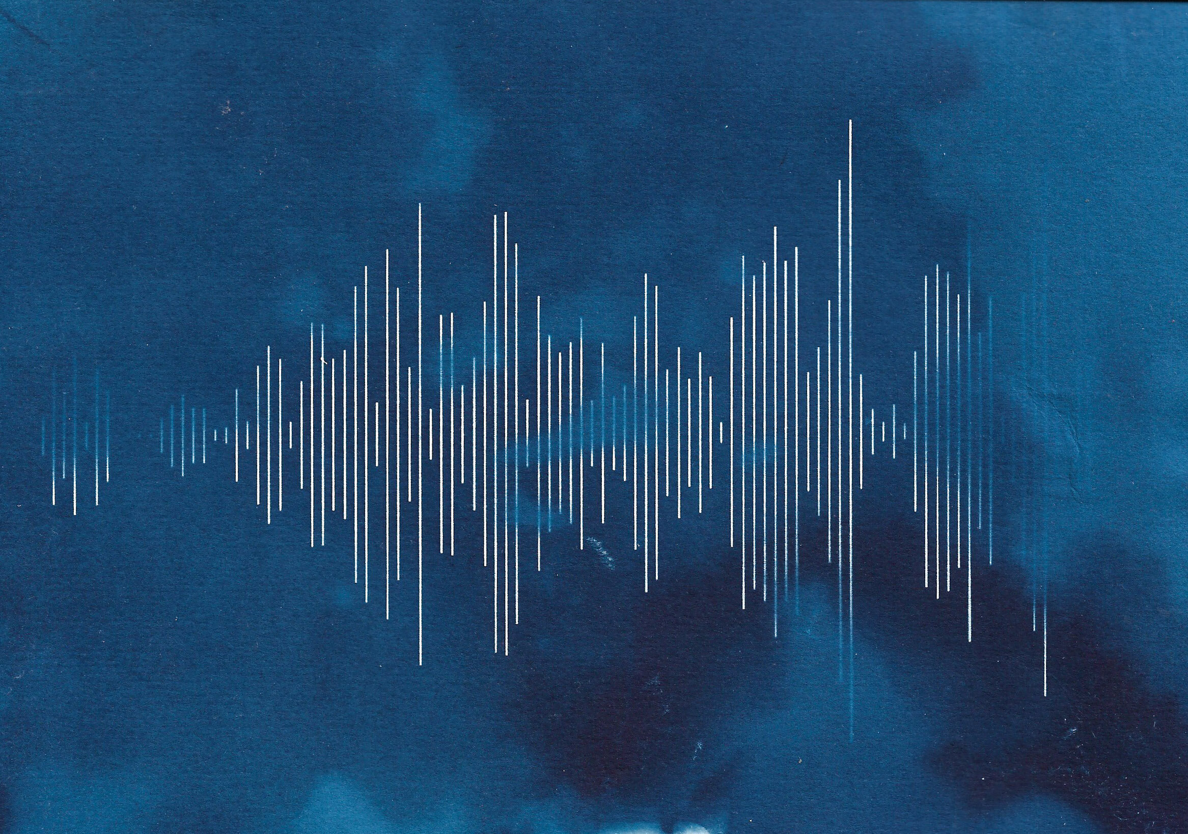
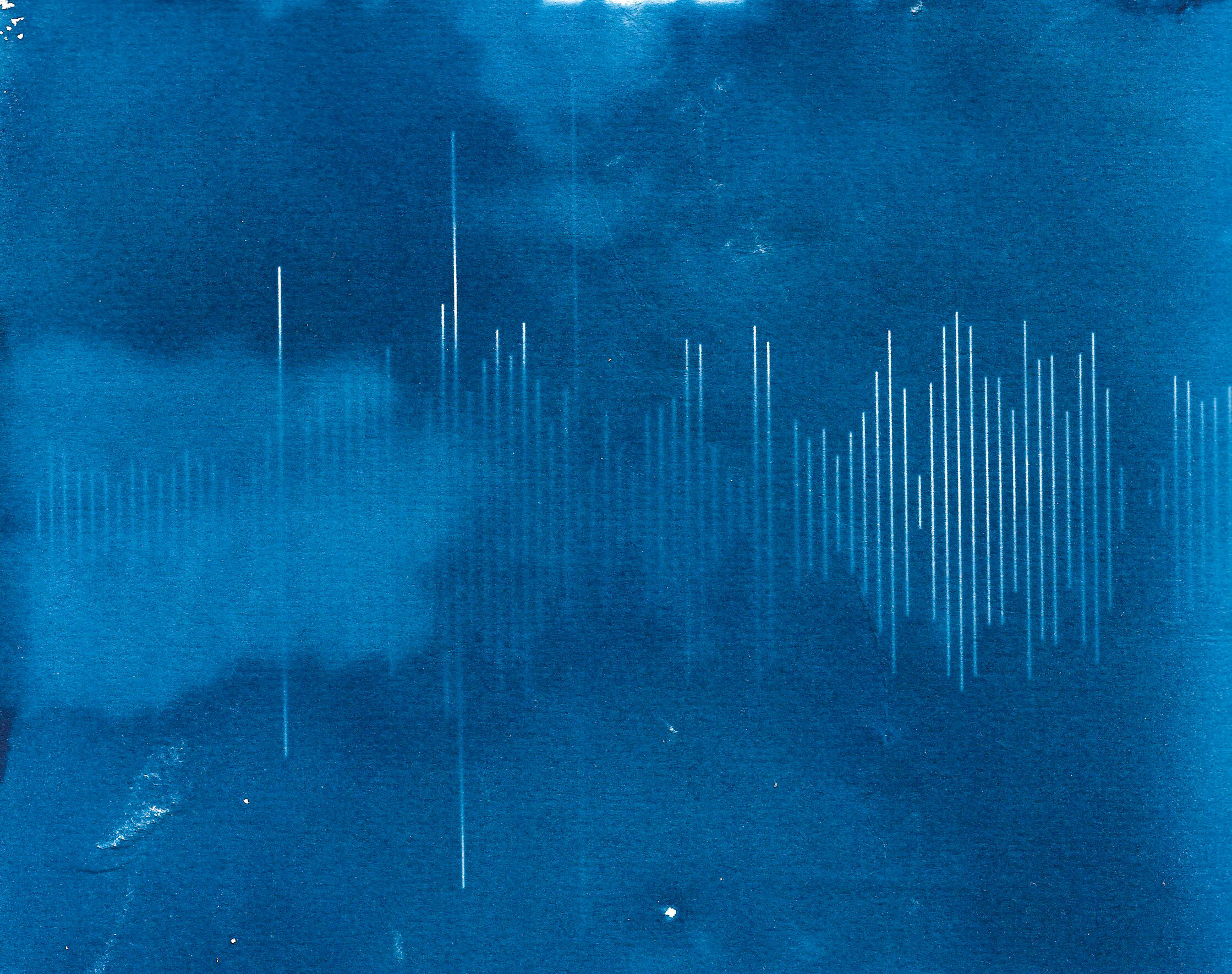
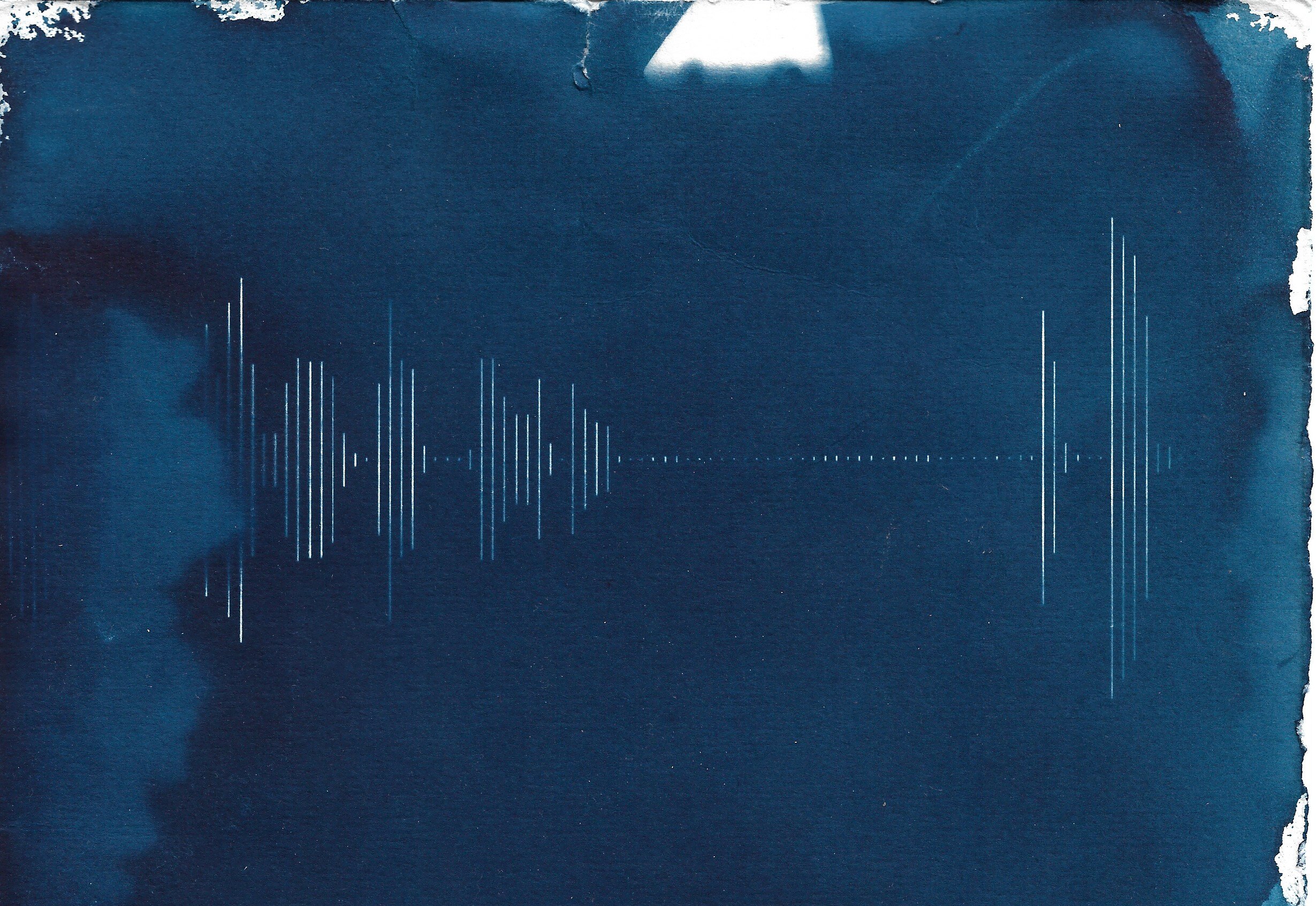
Not wanting to make the standard botanical cyanotypes, I decided to create prints of the waveform of my voice captured during an interview. I created two types, one where the image was inverted during the processing stage of creating the digital negative and a non-inverted version. The paper was treated with the solution a few months ago in a dark cupboard and kept in a light-tight environment. Not having access to a darkroom meant the solution was applied in a less than ‘perfect’ fashion, but I’ve grown to love the uneven application and the effect it has had on the prints.
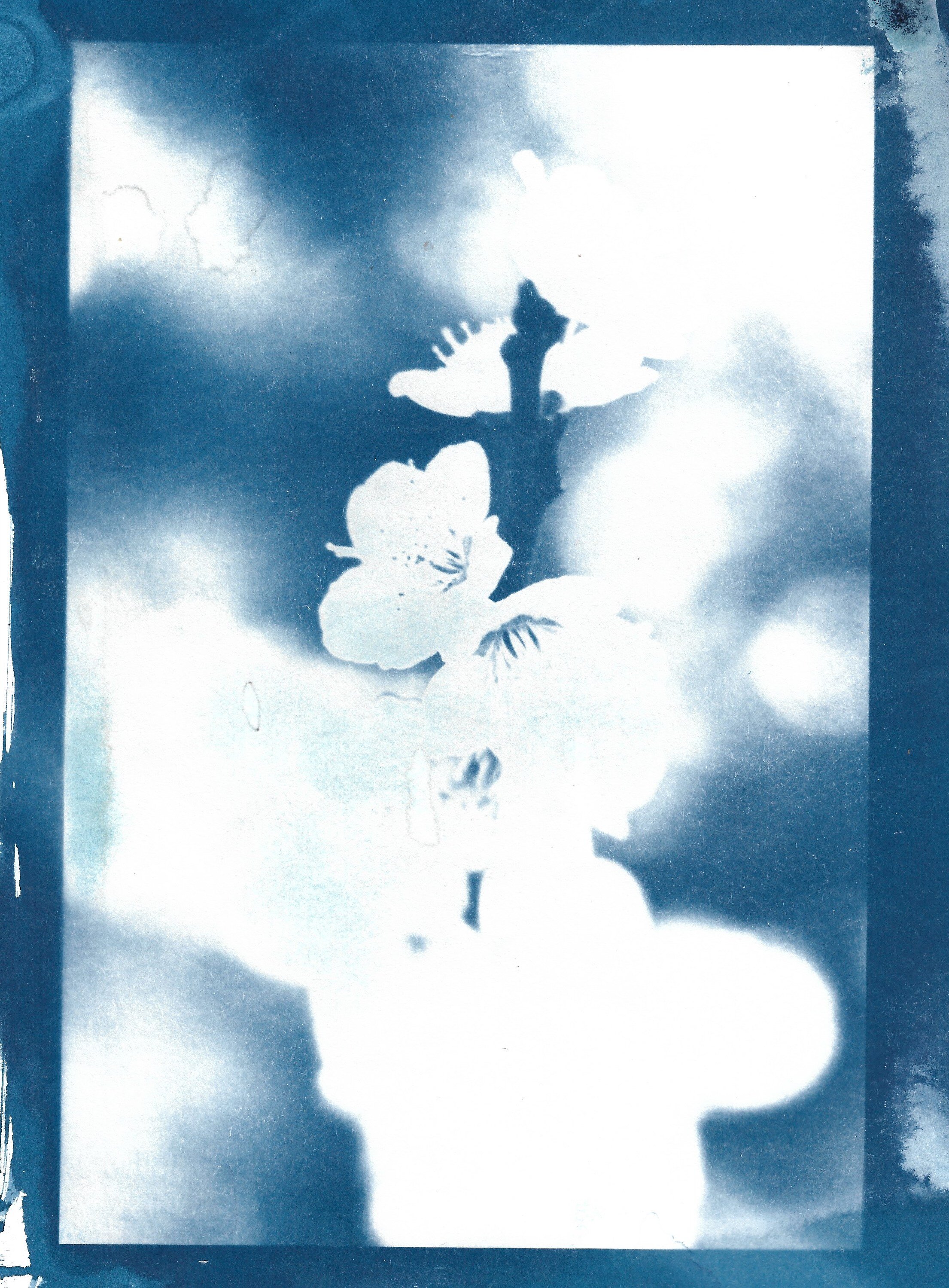
Waiting for the image to materialise was quite meditative; there was nothing I could do to hurry the process along, so I waited patiently. Whilst the prints were sitting in the late summer sunshine, I was not berating myself about the lack of progress being made in my ongoing project, but I was debating whether or not to expose the prints for another minute or two.
Whilst I was washing the prints, I was not thinking about posting the results on social media but trying to decide whether to tone them with tea and if so, which tea? Mint? Lemon? Builder’s? When the prints were drying I was only thinking about what other paper types to try. In short, I was not thinking about the outcome at all, but the process. Instead of tying myself up in knots trying to consider how creating these prints fit into my practice and therefore trying to justify the time spent creating them, I will simply enjoy the act of making something. Children aren’t taught to look at the bigger picture, to analyse why they coloured the car blue instead of red, or why they used pencil crayons instead of felt tip pens, they are allowed the freedom to simply enjoy the act of colouring in a picture.
So, for now, I will continue to take a childish, guilt-free approach to creating work and not stress over the fact that I have yet to take any project-related photographs. After all, time spent creating is never wasted, right?
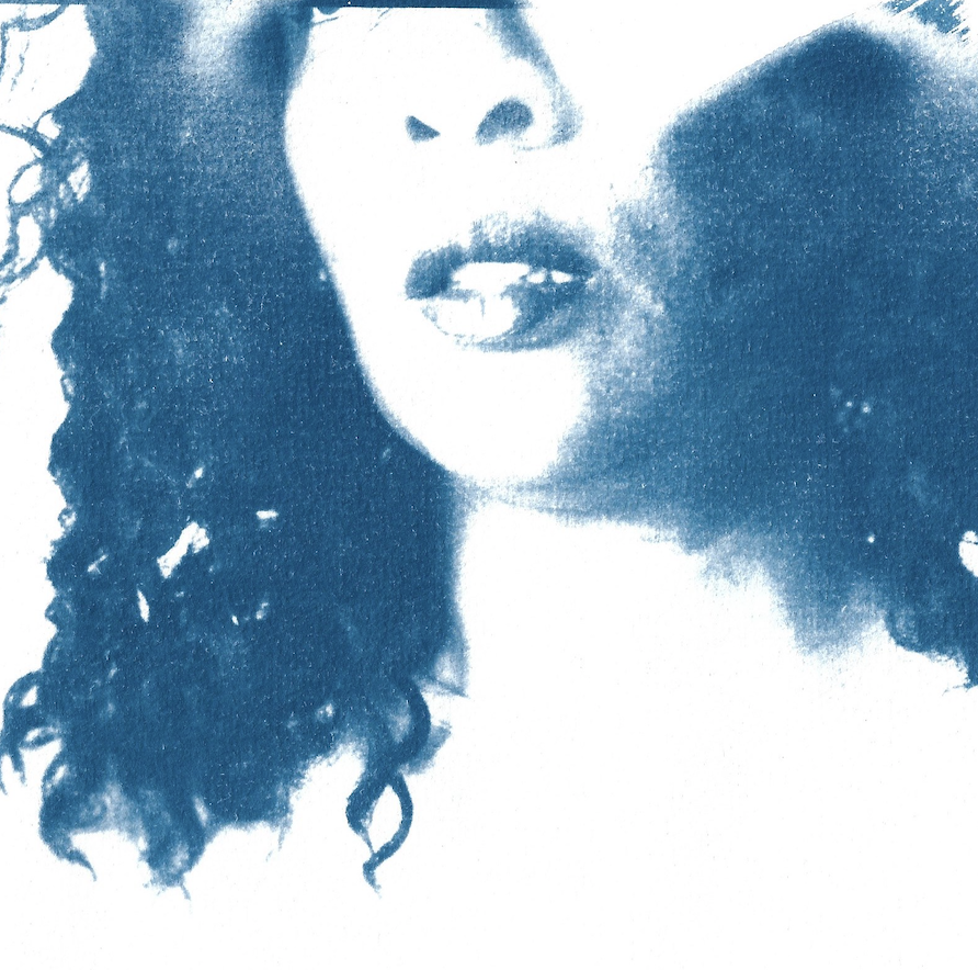
Self portrait, from a series on identity and representation

Selling Myself
Blending digital and analog processes
Aren’t interviews a funny thing? You sit in front of strangers, either online (weird) or in person (even more weird, what with the pandemic), with a fake grin on your face, trying to appear simultaneously relaxed and confident and friendly, whilst masking the nerves and fear and desperation, all the while panicking if you’ve remembered everything you’ve researched about the company in question, praying to the universe/God/Gods/ to let this be the one that you get because you really, really really want this one and you cannot face another interview. You are spent.
I’ve had many interviews recently. In one of them, my mind began to wander.
I began to notice how I repeated certain phrases in each one. “I’m keen to share ideas and learn my from colleagues”, “…it was a challenging time, but I have reflected on it and this is what I would do differently in the future…” and so on.
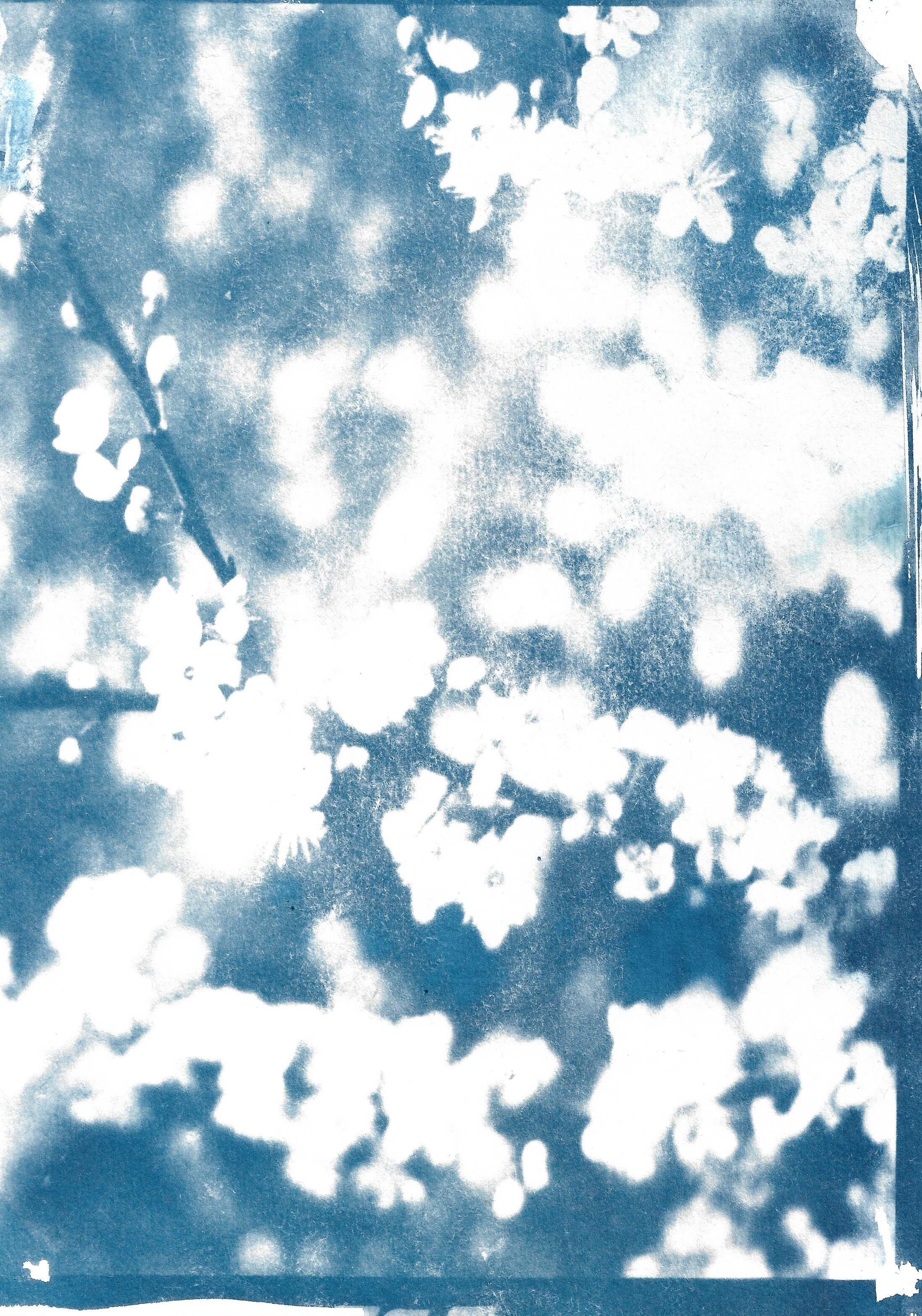
I began to think about what my voice sounds like (very Brummie) and then I wondered what does my voice look like. I recorded an eight-minute snippet of one interview for a job I really did not want and used the sound wave visualisation to create a digital negative. From there, it was a hop, skip and a jump to make a cyanotype.
I have been thinking about the fusing of very modern technology with the slow, almost meditative, traditional techniques and this was a perfect opportunity to experiment.
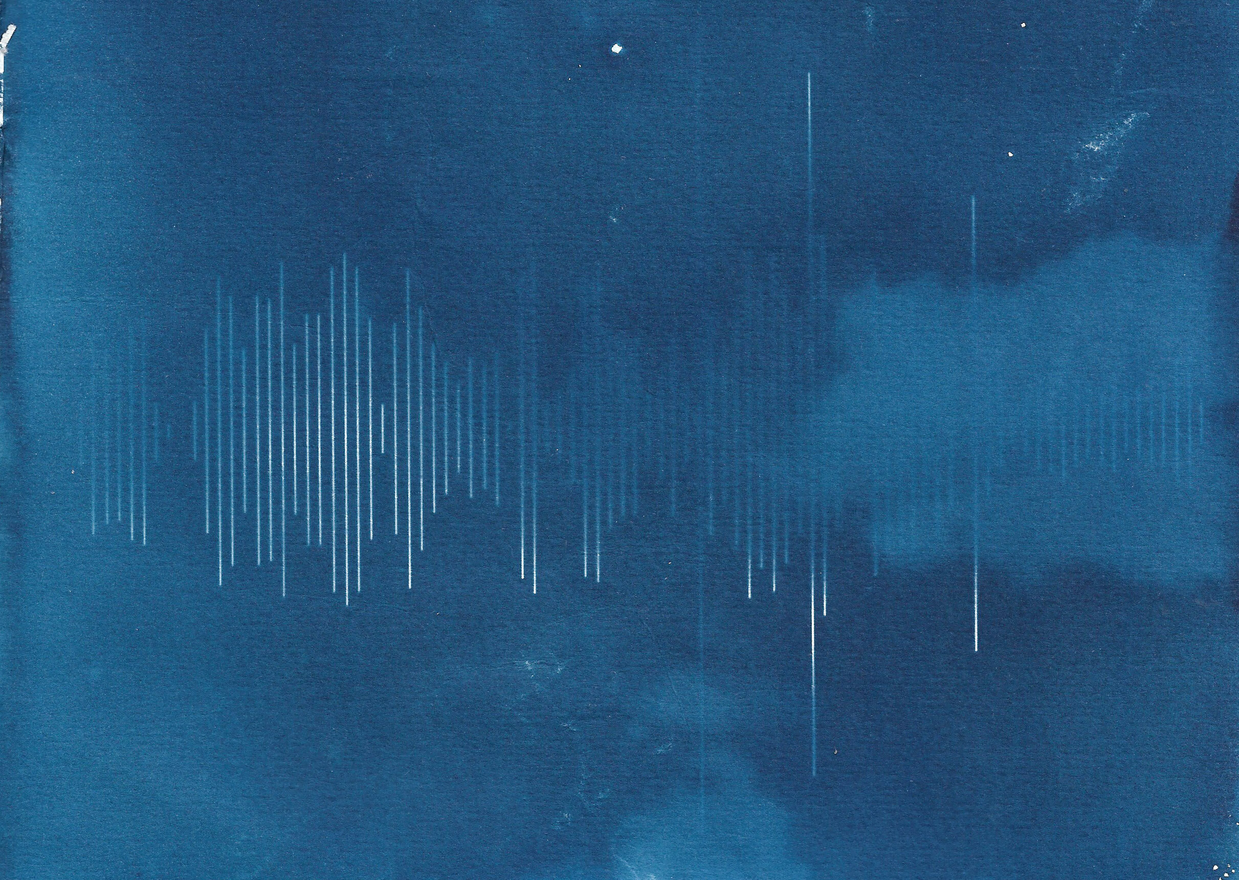
Part of the process its to invert the image during processing but this did not create the strong image I wanted.
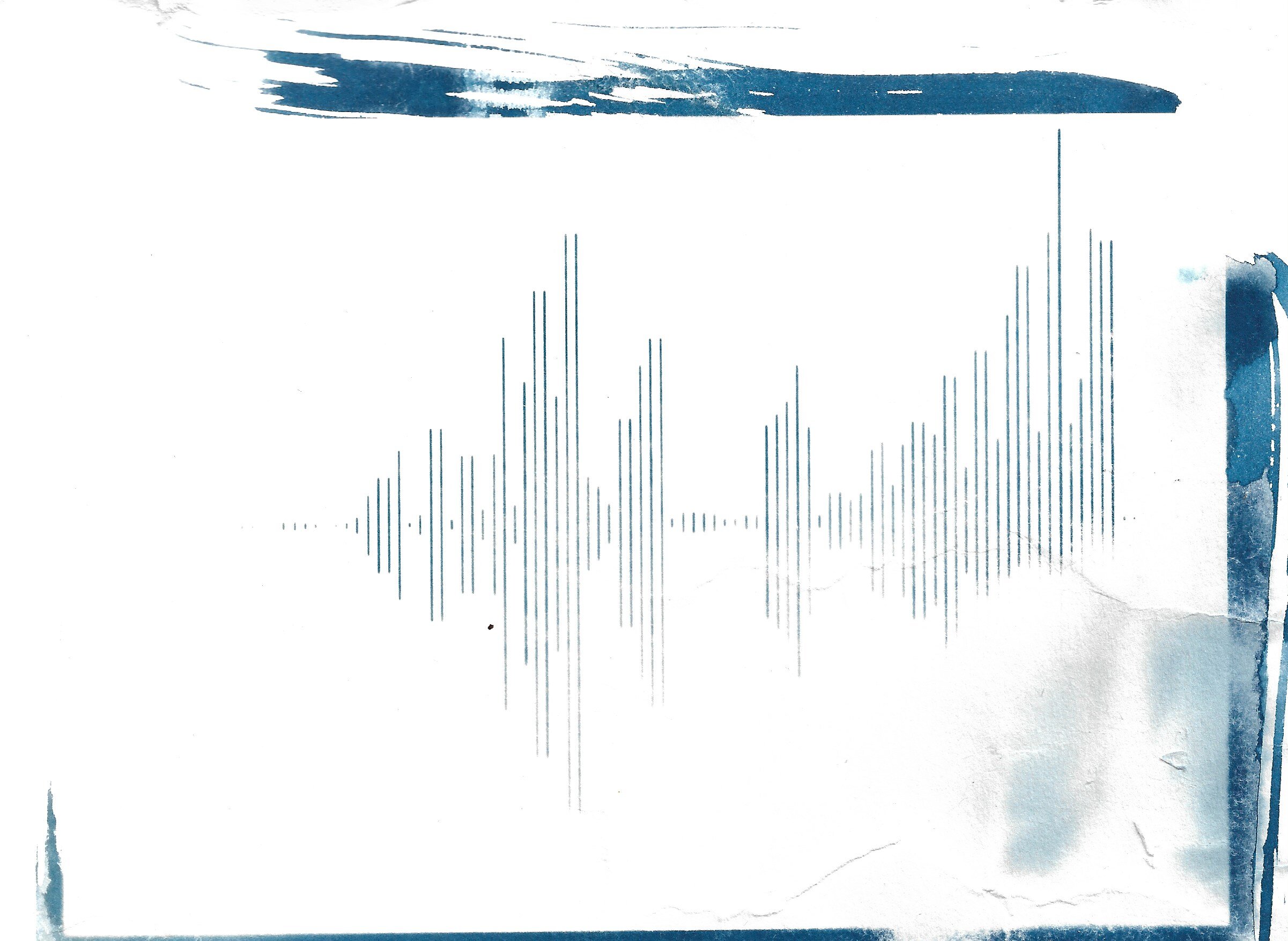
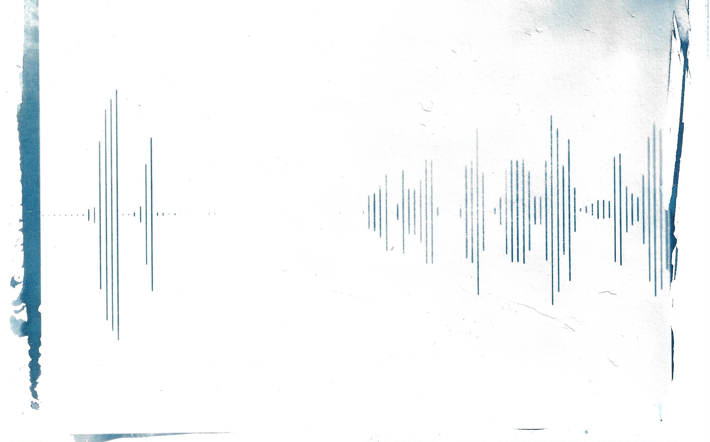
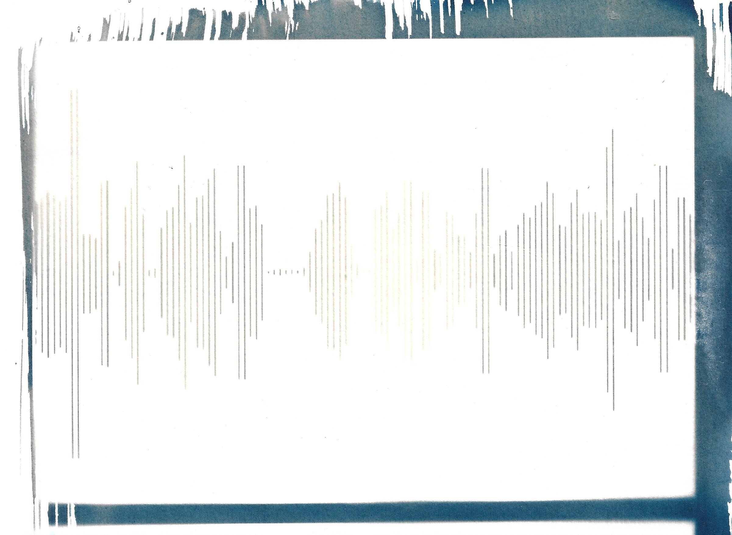
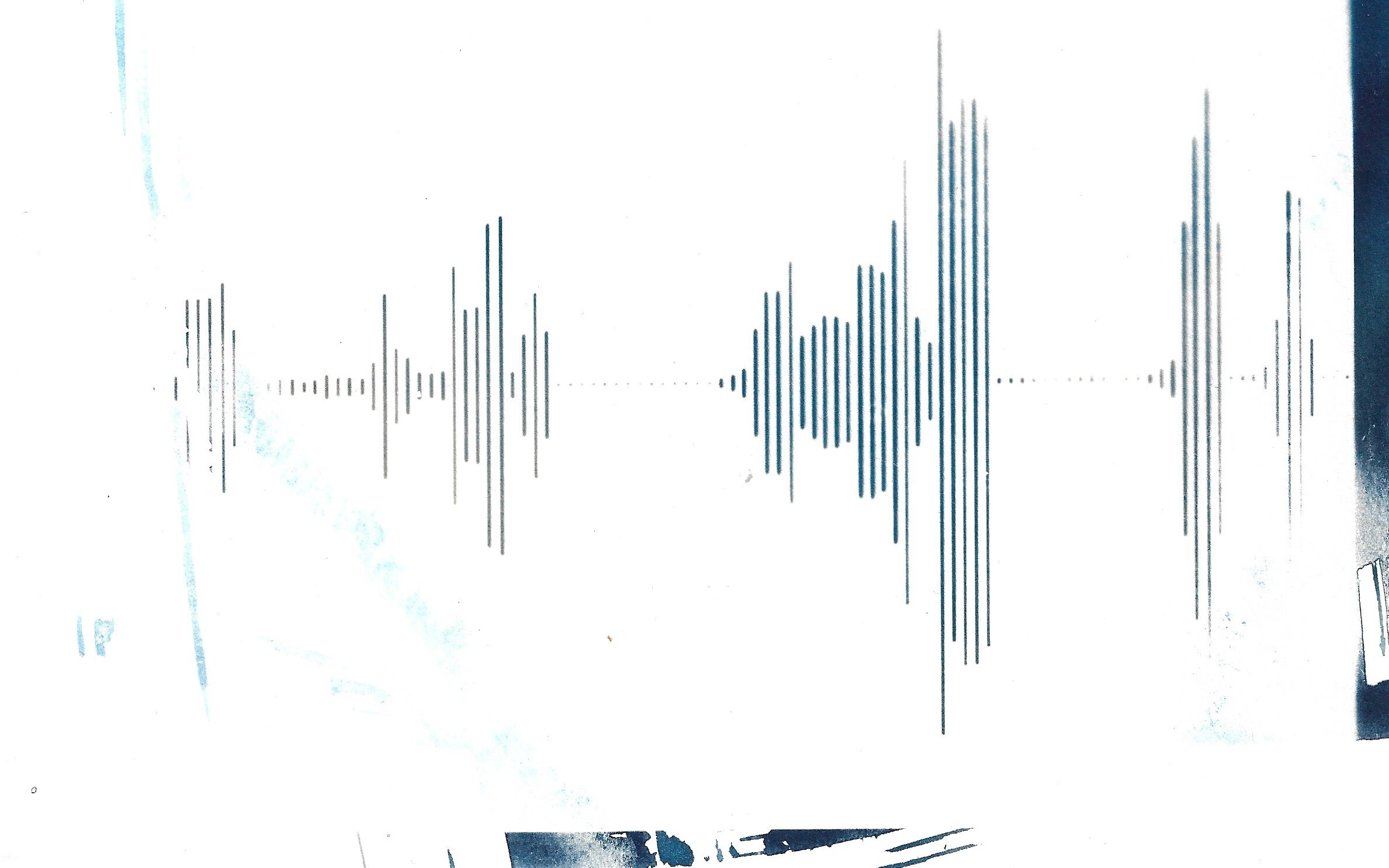
I created a second batch without the inversion but still pushing the contrast and enhancing the highlights and shadows.
These were exposed in slightly overcast conditions and in a shadowy area. I lost my nerve and exposed the prints for 22 minutes, where around the 15 - 18 minute mark would have been better, as the untreated areas would have created more dynamic prints.
Interesting; Laughing;
Thank You, Opportunities,
Have I Lost You, How Many
The paper was treated a few months ago at home, in a non-light-tight closet, at night, hence the uneven application.
There’s a metaphor there, if you care to look for it.

Behind The Scenes: Anthology of Rural Life
I was lucky to be invited to participate in the Meriden edition of Anthology of Rural Life, a project that “provides a comparative visual study of the continuities and differences in patterns of life within contemporary rural areas”, created by photographers and educators Colin Robins and Oliver Rudy.
Robins’ and Rudy’s work is inspired by renowned German photographer August Sander who documented the people and landscapes of Germany during the Weimar Republic. Sander photographed artists, farmers and bakers with a large format camera, to enable the tiniest details to be captured in the faces of his subjects.
Their work has taken them to Finland, Italy and Poland, and now, into the sedate heart of the West Midlands.
Thanks to Emma Jukes for the images.
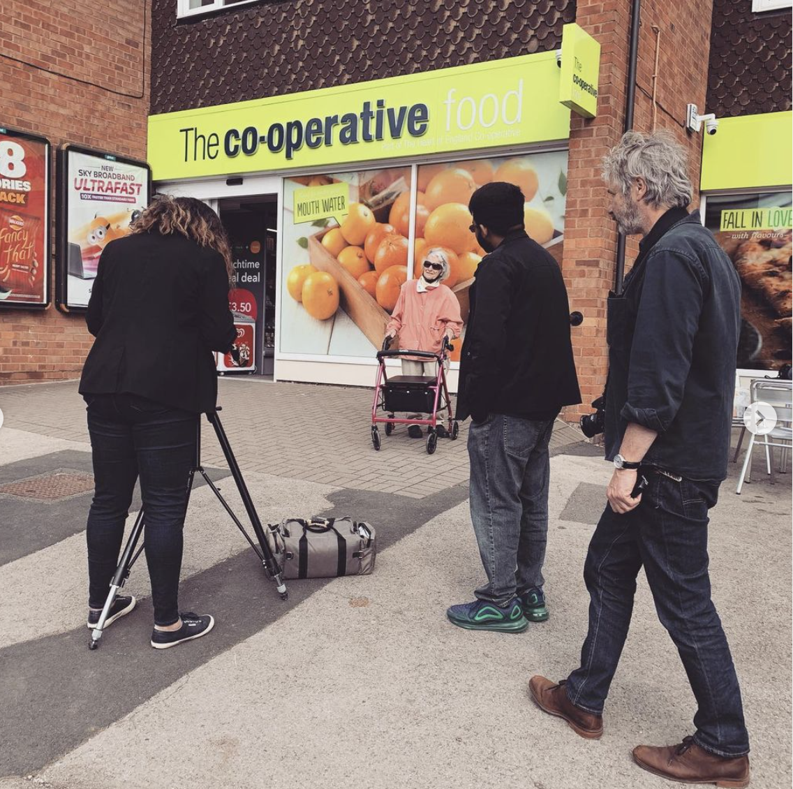
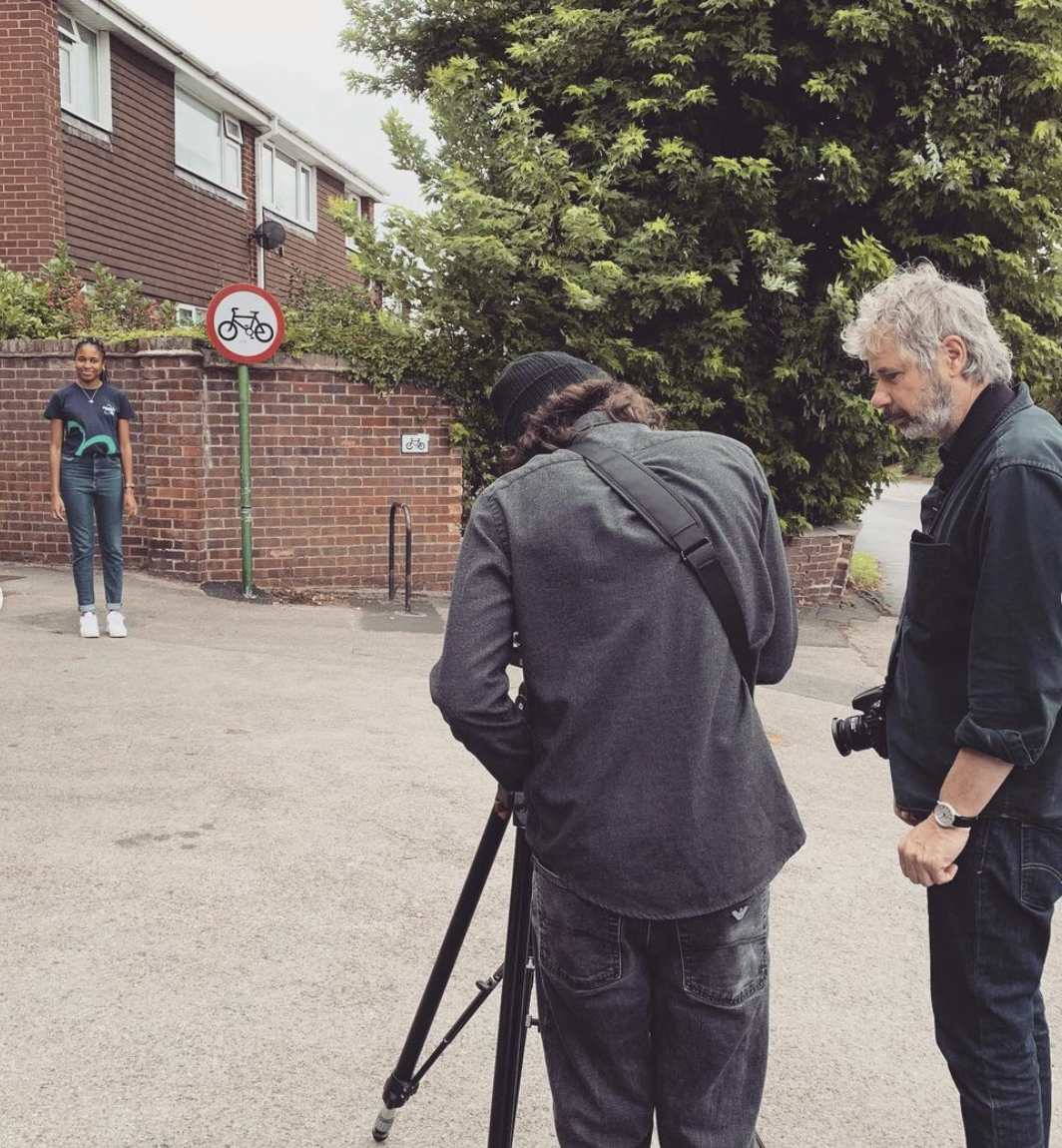
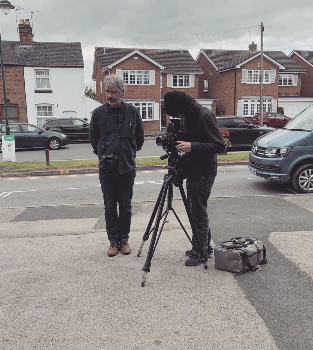
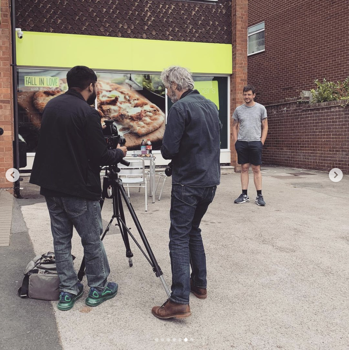
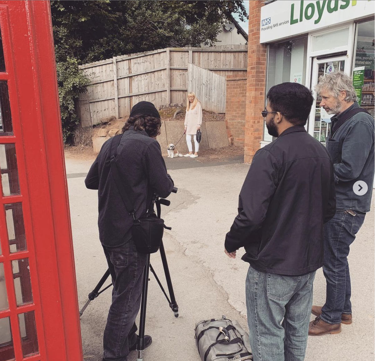

Photo London 2021

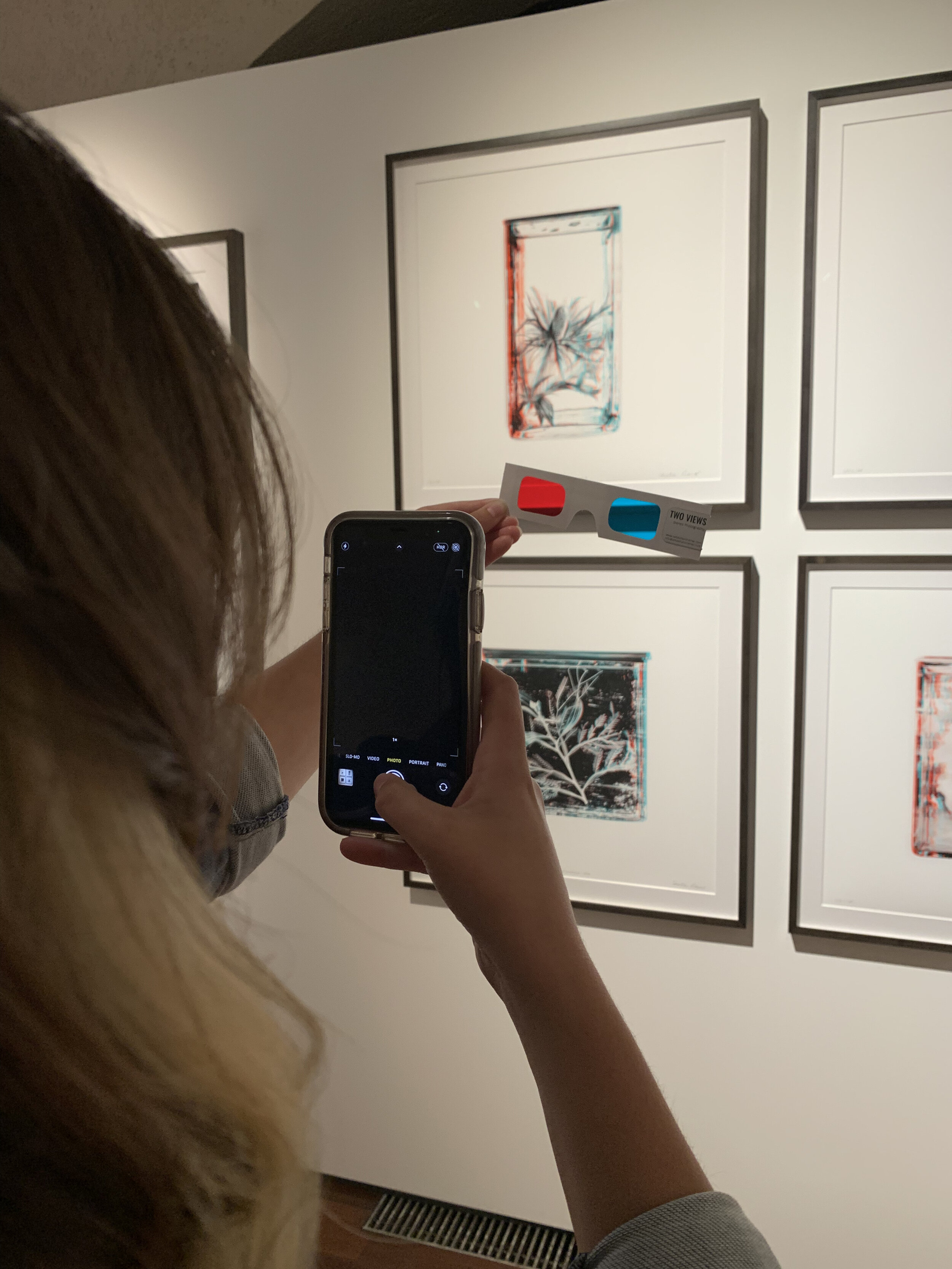
Photo London is a prestigious art fair held in the stately environs of Somerset House in London. Built in 1776 and undergoing several extensions, modifications and redevelopment until the mid-20thCentury, Somerset House is now home to an abundance of art, design, and cultural institutions, as well as independent artists. It seems only natural then, that Somerset House should be the home of Photo London.
Because of the COVID-19 pandemic, Candlestar, the producer of Photo London made a noticeable alteration to the regular format. Most of the talks, once held in person, are now held online over a period of 25 days, allowing ticket holders and non-ticket holders alike access to the informative and enlightening discussions.
Seeing art in person after an anxiety-ridden eighteen months of COVID-19 related lockdown was like the proverbial breath of fresh air. The fair, though busy, was noticeably more subdued than in previous years, as was evidenced by several empty spaces in the display areas. My companions and I mused on the fact that this may have been due to the financial implications of the global pandemic, with international exhibitors potentially having to quarantine before and after the fair.
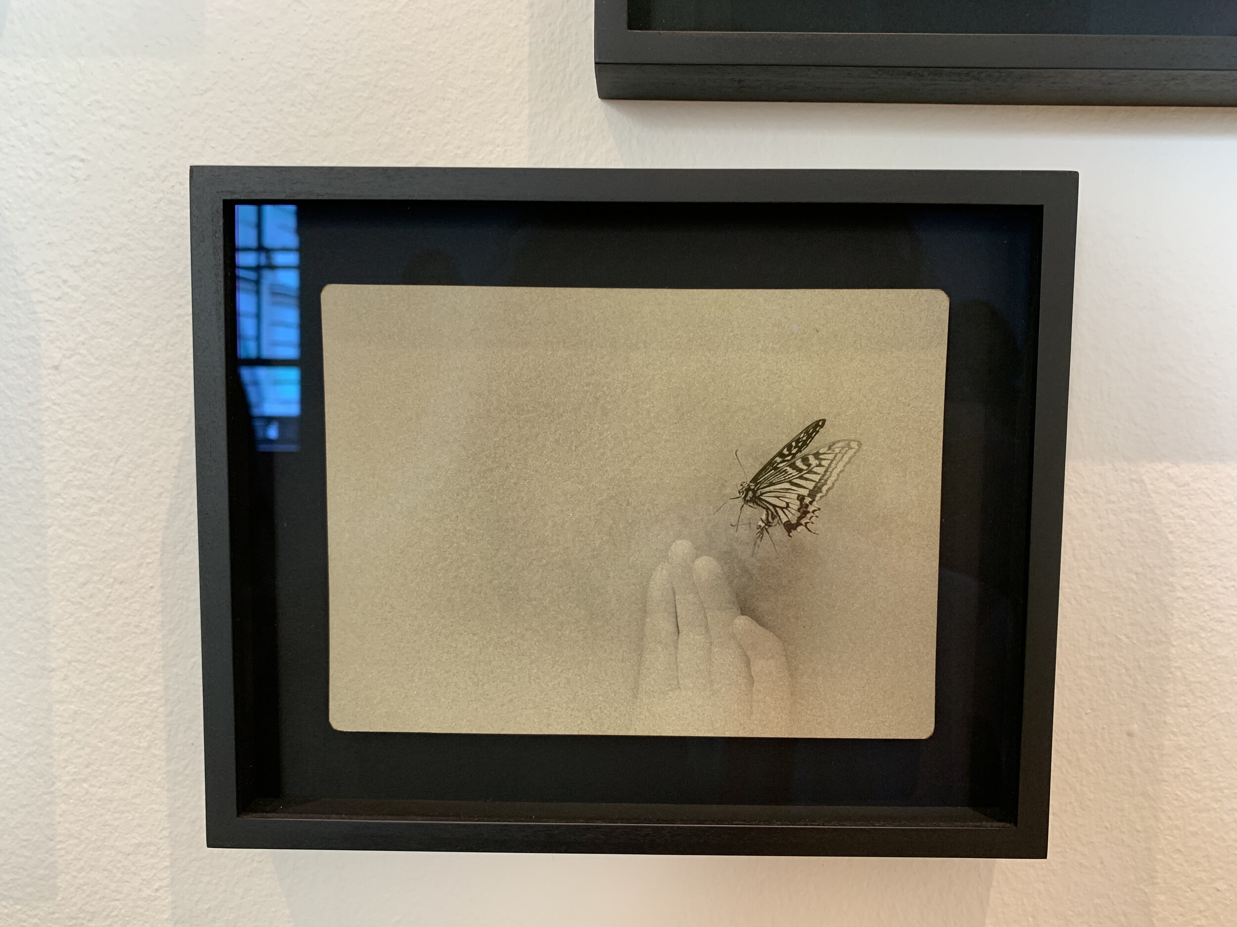
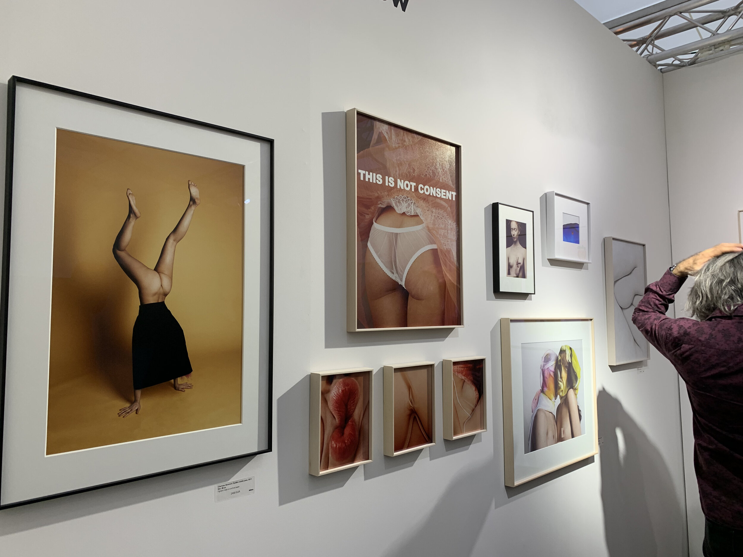
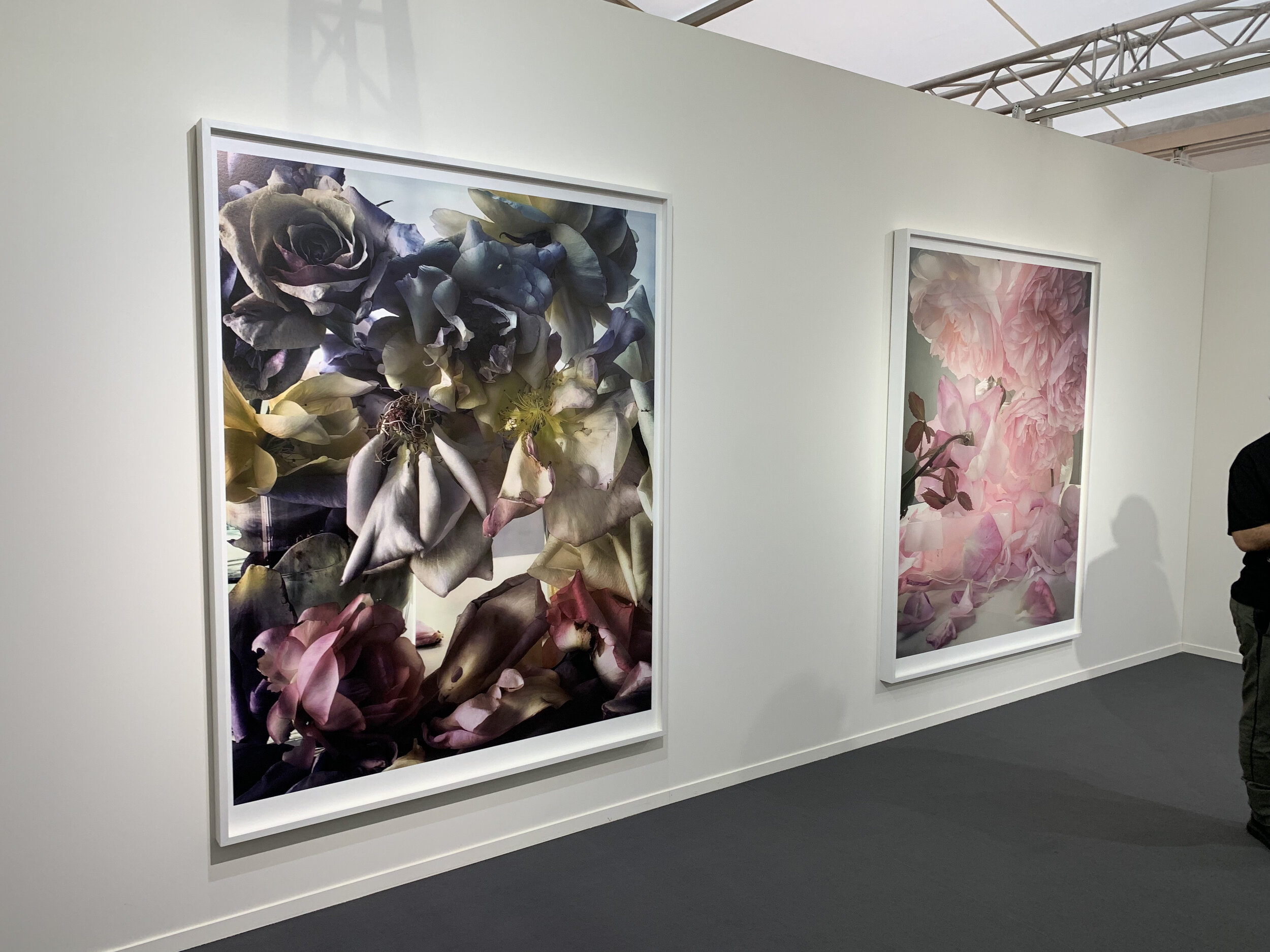
Manipulated images was a common theme: embroidered, punctured, sliced and folded images appeared to be a by-product of making work during lockdown. Having limited access to materials was no bar to creativity for many artists.

Jacqueline Woods, Full Bloom, 2020

Bettina von Zwehl, The Symptoms, 2019

Jessa Fairbrother’s punctured photographs allow light to stream through the image
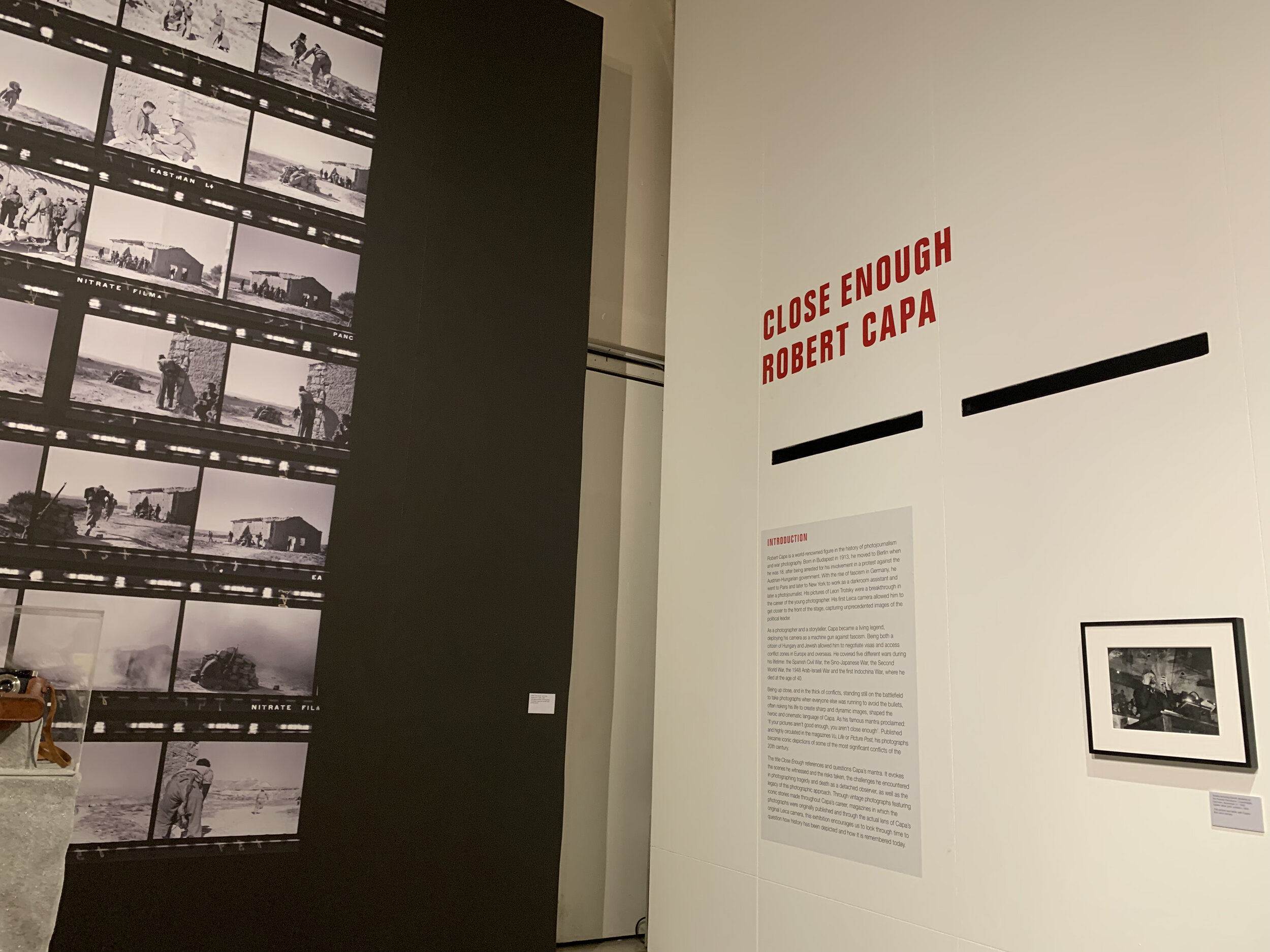
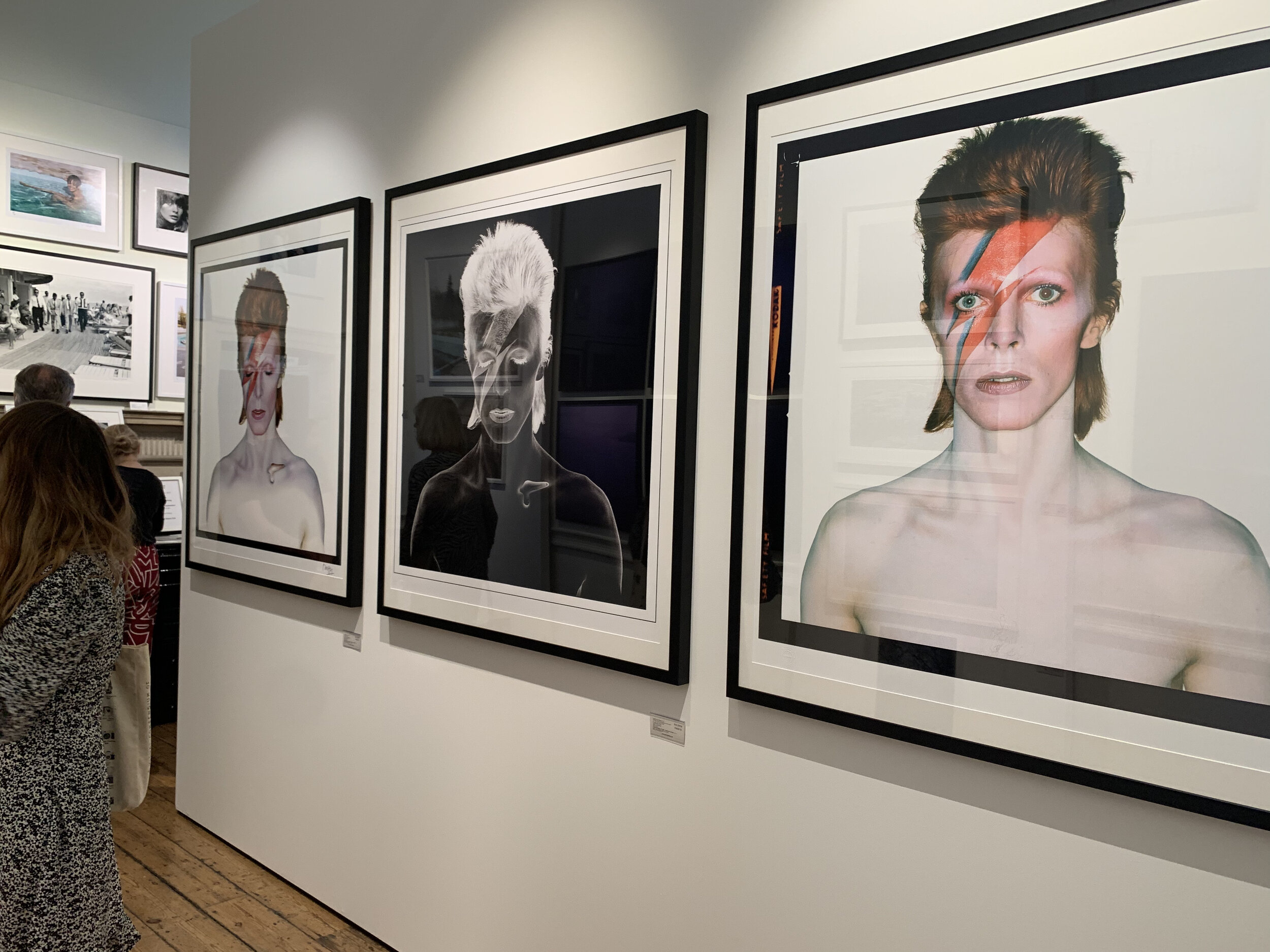
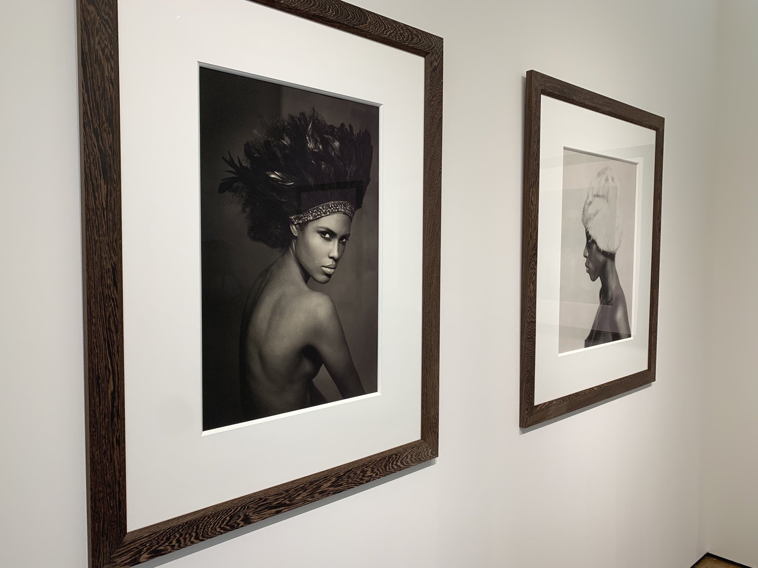
My personal highlights were ‘Close Enough: Robert Capa’, an exhibition of the renowned conflict photographer’s notable works and some of his personal artefacts, and Delphine Diallo’s wonderful portraits of Black women, displayed in the main Pavillion.


Delphine Diallo, Highness Copyrright Delphine Diallo
Having the opportunity to talk to gallerists, artists and institutions that serve to promote and champion photographers, like The Association of Photographers (AOP) The AOP was a great source of inspiration. I spoke to Seamus McGibbon and Nick Dunmur of The Association of Photographers about two of the association’s forums, f/22 which is a support and professional network for women and women-identifying photographers and AOP For All, a new forum created in 2020 with the aim of supporting photographers from culturally diverse backgrounds.
My top tips? Take a shopping bag so you can decant your postcards, magazines and books into it, so you don’t end up carrying large photobooks in your bare hands like I did, and wear comfortable shoes, like I did. Somerset House is huge.